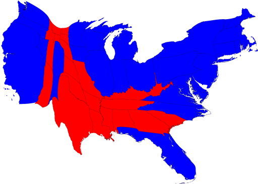
I love a good data visualization. A friend (thanks Rick) pointed me at this awesome site of different mapping permutations based on the 2008 election results . For example – election results based on a population cartogram.
Lots more on the site – check it out. Thanks Rick!
